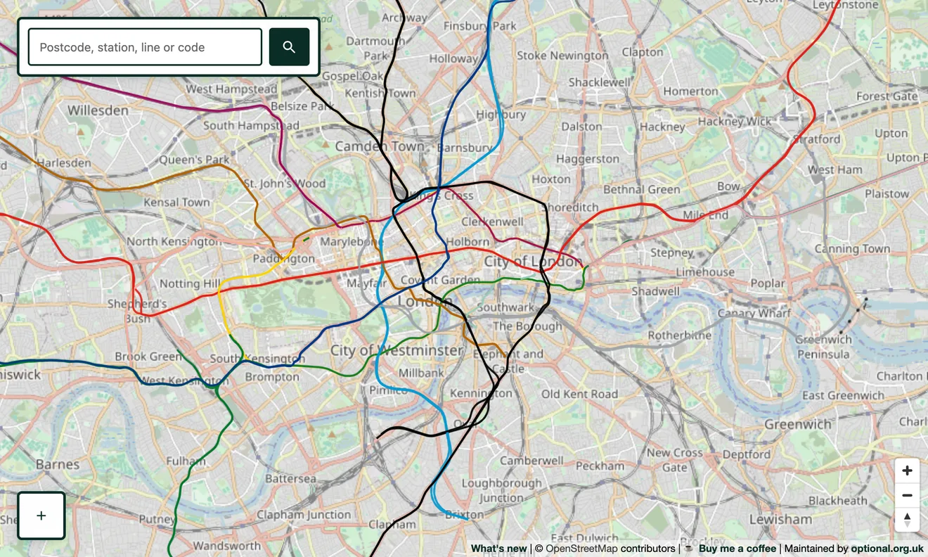
Real distances, real shapes
Switch on the London Underground layer and every line appears where it physically runs, so you can finally see how close two stations on different lines really are, where the lines run side by side, and just how far out into the suburbs the Metropolitan and Central lines reach. Every Underground station can be shown too.
The official line colours
Each line is drawn in its proper colour: Central red, Victoria light blue, Piccadilly dark blue, District green, and the rest, so the network reads at a glance. Hover or tap a line to confirm which one it is.
How it's built
The Underground is mapped in OpenStreetMap as route relations, which is how we colour each section by its line. It sits as its own switchable layer on top of the full national network, so you can see the Tube in the context of the mainline railways, not in isolation.
Going deeper
The same map carries the whole of Britain's railways, including disused lines, closed stations and heritage railways, so you can explore well beyond the capital.